Title screens. You know what they are. Whenever you start a game on your computer or console, the game cycles through a myriad of slash screens displaying the publisher's logo, the developer's logo, the engine used, etc. But eventually it always comes to the first screen you'll see in the game: the title menu.
I've been pretty busy lately working with Ameen, and getting a lot of design work done, as well as finalizing Dead Gear's native resolution, and working out some bugs and problems with the Unity engine. But until a few days ago, I still hadn't actually worked out an actual title menu screen, aside from some layout frames. Heck, I hadn't even really put any thought towards the game's actual logo!
When Daniel chatted with me a few days ago regarding the main theme of Dead Gear; I thought that it would really help inspire him if he had a closer idea as to what the music would be accompanied by on-screen. So I gave him a few mockup splash screens that would appear right when you boot the game up.
 |
| An animated splash screen that eventually fades into: |
 |
| This! The logo for Daedalus Games. |
This splash screen is followed by this:
 |
| A static splash screen for the COGS project; a series I hope to continue. |
But I had yet to create the actual title menu or Dead Gear logo. So I set myself to brainstorm mode and, through a lot of trial and error, came up with this:
 |
| The current Dead Gear Logo. |
As anyone who has tried their hand at graphic design will tell you, the art of crafting an excellent logo can be maddeningly difficult. I must have tried ten dozen different ways to create a clever logo that somehow incorporates a gear into the letters themselves. My best effort? A G that looks kind of like this:
 | |
| if you flip it on its side, it kind of looks like a flamingo's head |
 |
| To fans of my comic and not-comic, it might look familiar! |
 |
| Galaga, or wall of text, the game? |
Back in the 80s, menus screens were almost carbon copies of their arcade counterparts. In arcades, menu screens were pretty barebones, and served a few pretty simple purposes: to display the current high score, to display the game's logo as prominently as possible, how many credits had been inserted and as a small menu to choose whether to or not you'd be playing with other people. As a general rule for the early title screens, it always seems like there's more text than anything else taking up the real estate of the screen, and then programmer art.
 |
| Damn your rustled, windswept hair, megaman. |
Eventually, as the 90s progressed and tastes were refined, only a single unwritten rule remained: The game's logo should naturally take up a large portion of the screen space, with a small copyright text. This wasn't so much a rule as it was common artistic sense: this allowed the title screen to be both pleasing to the eye, and it gave the developer a chance to hook players into the game. If the players weren't sure if they wanted to play the game, they sure did now.
The Zelda and Chrono Cross title screens were interesting, as they were simply the game's logo imposed over a moving 3D background, displaying gameplay or the game world itself instead of static art or imagery. Zelda's title screen played the iconic Zelda theme while listening to the stomping of Epona's hoofs, which was for many who played the game, an extremely memorable experience. Chrono Cross' title screen played soothing music while moving a camera through a beautiful underwater landscape. Many other games eventually took that path as well, although many still opted for classy static backgrounds and art.


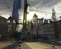
Now, in the modern age of gaming, developers have tried to keep things as simple as possible. Many indie games and many AAA-quality games still go for the simple, static approach. Other developers try to mix it up a little, like how Valve cleverly changed the backgrounds of Half-life 2 depending on what section of the game you were currently on; serving as a sort of reminder to the player as to where they last left off. (Minecraft used a similar idea as well, using a generated world as the background for the title screen.)
So by looking at all of these, what do we need in a successful title screen?
I would say that it really only requires three things:
-A good, strong title/logo.
-A non-clashing background. If the background clashes with your logo and the menu, it will look amateur. If you want an example, take a look at the majority of flash games.
-Music and/or sound! Tying a memorable song to the main menu/title screen is important, as the players will be going through it each time they play the game.
With Dead Gear, I decided to go with a more static, simple imagery; simply because I felt it worked best. The maps, ink and paper slowly shift in the background so it isn't just a flat, unmoving image. Anyway, that's my little talk on title screens. Sorry for the lack of updates this month! In August I'll try to go for one update per week.
Take it easy,
-Alex


No comments:
Post a Comment