
Before going into it, let's do a little refresher course on the various design theories. HUDs (Heads Up Display) are basically the method by which information is visually relayed to the player, as part of a game's user interface. That's the technical term, but we all know it as the 'Number of lives you have left' and the 'score' up in the corner of the screen. You might also know it as the HP gauge, the ammo, the compass, etc; basically anything that the player NEEDS to see while playing a game; should be in the HUD.
Some designers have deemed the HUD an artifact of the arcade-era, and have tried to design games with an absolutely minimal HUD. Some of these games, like Ico and Shadow of the Colossus, used this to great effect and created an almost surreal, cinematic experience. These games proved that you could have a well-designed, easily playable game without pesky menus breaking the player's immersion.
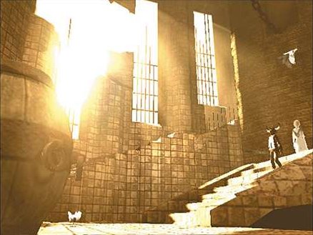 |
| Ico went through great lengths to create a seamless, cinematic experience to minimize breaking player immersion. |
Other games followed their lead, such as Limbo, and several other more indie/artistically-inclined games. Even First Person shooters began to remove some thought-to-be-essential HUD elements, like the Health meter. (As mentioned a few months ago in the game mechanics post.) However, on the opposite side of the scale, some genres demand constant micromanagement, such as RPGs and MMOs.
 |
| oh my god no |
Keeping in mind that Dead Gear is not meant to be an artistic experiment, nor a horrible abomination, I decided to try and keep Gameplay HUD to a minimum, by keeping only the most essential elements grouped together in the top left corner: Health, Anima, the currently equipped magic, and the number of prisms (serves as a form of currency in-game) collected. I also included a small notification in the bottom right that displays the name of the enemy last damaged by the player.
 |
| Dead Gear Gameplay HUD |
I've also been modifying and fiddling around with the gameplay menu, where the player can check their status, the time played, the % of the game completed, etc. They can then switch to their inventory or fusion menu screens. My original idea for the menu was that the menus were juxtaposed on top of large, slowly moving gears that cover the screen. I haven't decided on whether this crosses the line from 'interesting' into 'distracting,' though.
 |
| Current layout for Status Menu |
Each time the player opens the menu, the Gears will move in from the sides of the screen. Let me illustrate the idea with terrible little doodles.
 |
| 1 |
 |
| 2 |
 |
| 3 |
Anyway, that's my little spiel on HUDs and the current state of the Dead Gear status menu.
-Alex
No comments:
Post a Comment